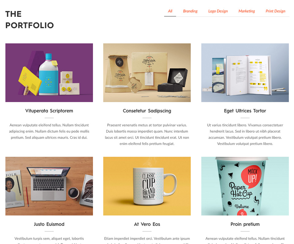
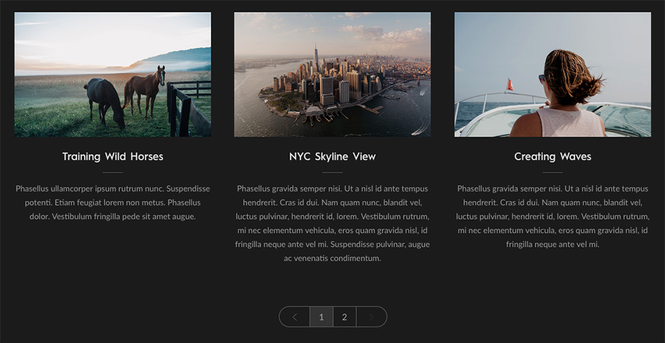
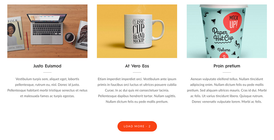
Perhaps the most popular and most important of all addons part of this plugin, Posts Grid helps you build a multi-column grid of posts or custom post types. The posts displayed are filterable by taxonomy terms.
Using the Grid widget, you can construct a portfolio of your work/services/products. We recommend you use the popular plugin – Portfolio Post Type Plugin for building a collection of portfolio entries. Once the portfolio entries are in place, make sure you select Portfolio Post type under Post Type entry in Build Tools window as explained below.
The premium version of the plugin has support for WooCommerce, 6 different styles, 7 Heading styles, AJAX based category/taxonomy filtering, pagination, lazy load with load more button, infinite scroll, and lightbox option for images. The additional posts are loaded via AJAX when the user navigates through the pages populated or when the user hits the Load More button.
For help with configuring a WooCommerce grid, visit our online documentation for WooCommerce Grid.
Posts Query
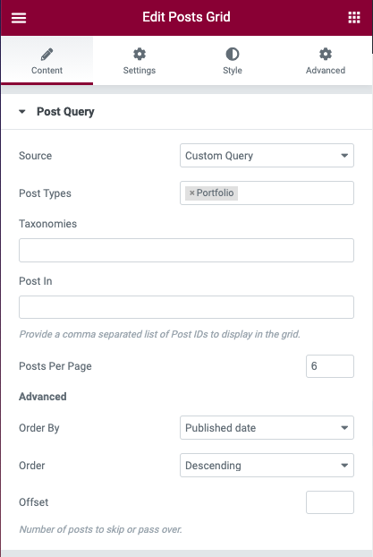
The element features a Posts Query window to help choose posts or custom posts to display. This powerful tool has number of fields to control what gets displayed and in what order with an additional field available to provide query arguments explained in the codex page.
The Posts Query tab has the following options for filtering posts –
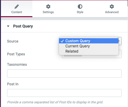
- Source – Can be Custom Query, Current Query or Related. The grid can be utilized to display a custom query specified by the user using the fields below or can display the posts returned by the current query or can display related posts for the current post based on taxonomy of the current post. The Current Query and Related options are useful when creating theme builder templates for post archives and single posts.
- Post Types – Select the custom post type that you need the element for. By default “All” is selected.
- Taxonomies – If you need to filter the posts by specific category or taxonomy terms, you can choose one or more of the taxonomy terms from this dropdown.
- Post In – This field enabled you to specify the post ids of the posts or custom post types you would like to include in your widget. Provide a comma-separated list of Post IDs to display in the carousel.
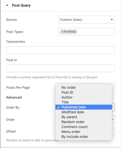
- Posts Per Page – Set the number of posts you wish you display in the widget. If the element does not support pagination, the number of posts displayed is limited by the number specified here. This is also the number of posts to display per page when the element supports pagination as is the case with the Posts Grid widget. Choosing the value zero makes the widget all the selected posts.
- Order By – Lets you decide on how you want the posts to be ordered – by Published Date, Modified Date, by Post ID, by Menu Order, Comment Count, Post Title (alphabetical sort), etc. and whether you want the ordering by Ascending or Descending.
- Order – Can be ascending or descending sort order applied to the Order By parameter above.
- Offset – Number of posts to offset or skip or pass over when fetching query results.
Posts Grid Skin Options
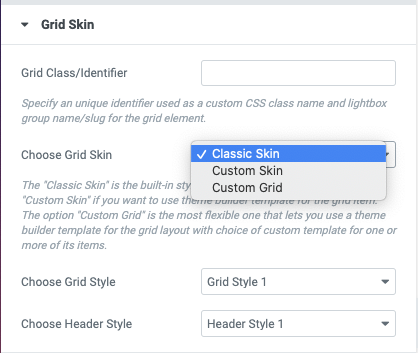
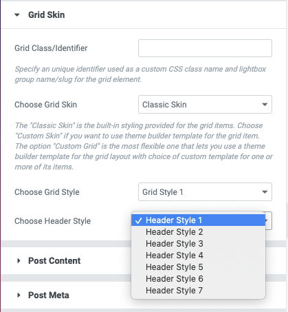
The Grid Skin group lists three options – Classic Skin, Custom Skin, and Custom Grid each of which is explained below –
- The “Classic Skin” is the built-in styling provided for the grid items. The premium version support 6 Grid Styles (apart of additional 2 WooCommerce styles) that let you display posts in a variety of ways.
- Choose “Custom Skin” if you want to use a theme builder template for the grid item. If you find the 6 built-in grid styles to be insufficient or do not meet the exact needs of your project, you can choose the ‘Custom Skin’ option to create a custom grid style of your own.
- The option “Custom Grid” is the most flexible one that lets you use a theme builder template for the grid layout with the choice of a custom theme builder template for one or more of its items.
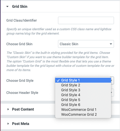
When Classic Skin option is chosen, the Posts grid supports 6 different grid styles along with 2 additional styles specific to WooCommerce products-
The Posts Grid module further provides 7 different heading styles which lets you choose multiple styles of category/taxonomy filters for the grid.
The Custom Skin and Custom Grid features are best explained with a video tutorial on YouTube. These options are really powerful and can help take Posts Grid to next level in creating a new class of widgets as demonstrated in the video.
Posts Grid Content Options
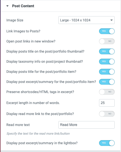
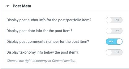
The content displayed as part of a post grid item can be controlled by enabling and disabling content attributes listed in the Post Content and Post Meta control groups –
Posts Grid Settings
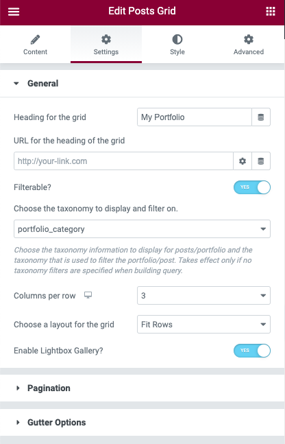
The grid element has numerous other options to control the display of posts or custom post types. Some of these are –
- Choose Taxonomy to display and filter on – The terms of this taxonomy chosen will be used for filtering the posts if ‘Filterable’ option is checked. When the post info is displayed, the specific taxonomy you want the info to use. For example, choosing category will make the posts filterable on category while choosing ‘post_tag’ would make the posts filterable by post tags instead of category.
- Choose a Layout for the grid – You may choose Masonry or Fit Rows layout for the grid.
- Link images to Posts/Portfolio – Make the post images link to the posts or custom post types they represent.
- Enable Lightbox Gallery (Pro!)– If checked, the images part of the grid entries will have a lightbox option enabled to display a gallery of post images in a popup display.
- Columns per row – The number of posts/portfolio items to display in each row on desktop.
Pagination Options
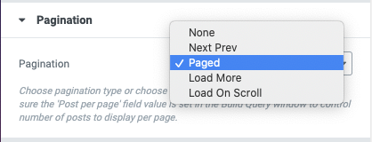
The pagination options supported by Posts Grid (Pro version) are listed below. Choose pagination type or choose None if no pagination is desired. If you choose any option other than None, make sure the ‘Post per page’ field value is set in the Build Query window to control the number of posts to display per page.
- If the Pagination option chosen is Paged, the grid displays a paginated grid of entries with links to various pages displayed at the bottom of the grid, provided a sufficient number of entries of this post type has been created by the user and the Posts Per Page value is set to a lower value than the number of entries created.
- If the Pagination option chosen is Load More, the grid displays a Load More button below the grid of posts/portfolio with an option count of remaining posts/post types yet to be loaded. When the users hit the Load More button, a number of posts/portfolio entries equal to the ‘Posts per Page’ value will be lazy-loaded into the element via AJAX. Upon loading all of the remaining entries, the Load More button is no longer shown.
Do check the option ‘Display count of posts yet to be loaded with the Load More button’ to display the remaining post count with the Load More button. - If the option chosen is ‘Load on Scroll’, the additional posts are displayed as the user scrolls down the page and hence works like the infinite scroll function.
- If the option chosen is ‘Next Prev’, two buttons are displayed that help the users navigate to the previous and next page part of the pagination. Unlike the ‘Paged’ parameter, the numbered pages are not displayed.
Posts Grid Style Options
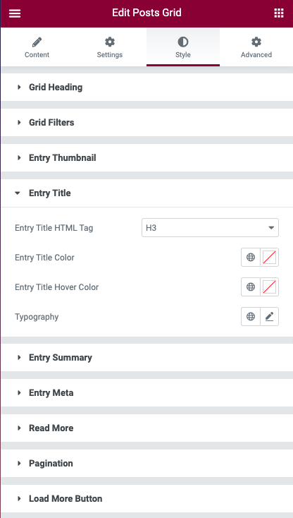
The Posts grid provides a large number of customization options in the Style tab including the typography controls.
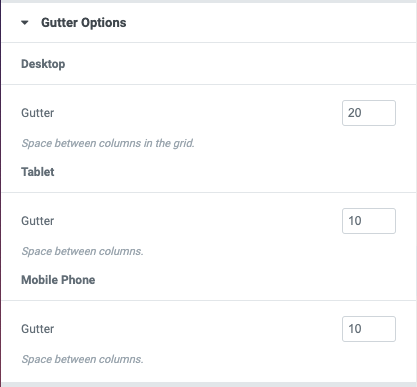
The spacing between the grid items can be controlled by choosing the gutter size for desktop/tablet and mobile resolutions –


