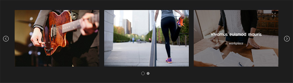
You can create a carousel of images/videos (or a combination of both) for showcasing your work or video content uploaded to Vimeo/YouTube. An instance of this element can capture a portfolio of work like that of a photographer or graphic designer/artist.
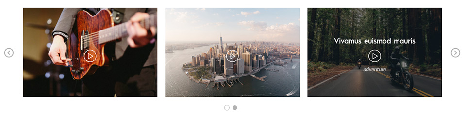
It can be used to create a carousel of videos uploaded to YouTube/Vimeo – useful for video bloggers, video tutorial sites, video marketers, small businesses or websites with a major presence on YouTube/Vimeo. The videos can be played with a single click of the play button on the gallery item as seen in this demo page.
The option for creation of video carousel is similar to that of image carousel – requires input of URL for the Vimeo/YouTube video along with placeholder image.
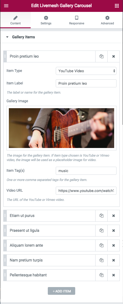
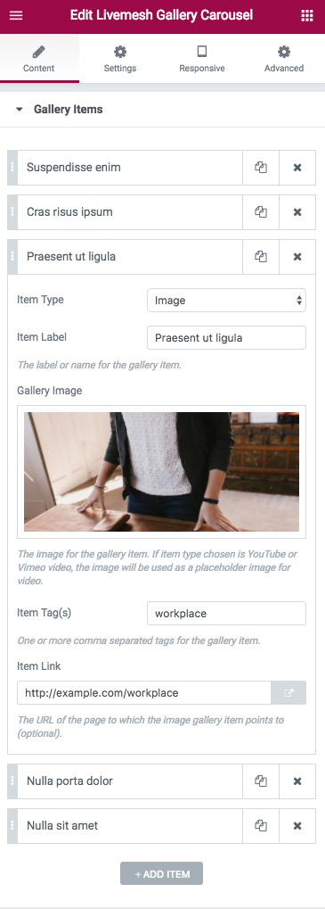
Each of the gallery items in the carousel capture following information –
- Item Type – Can be a Image or YouTube Video or Vimeo Video.
- Item Label – The label or name for the gallery item. This label is displayed on mouse hover over the image.
- Gallery Image – The image for the gallery item. If item type chosen is YouTube or Vimeo video, the image will be used as a placeholder image for video.
- Item Tag(s) – One or more comma separated tags for the gallery item. Useful when items are made filterable.
- Page URL – The URL of the page to which the image gallery item points to (optional).
- Video URL – If the item represents a Vimeo or YouTube video, provide the URL to the video. Any gallery item representing a video is given a play button. Upon clicking the play button, the Vimeo/YouTube video opens up in a lightbox window for playing.
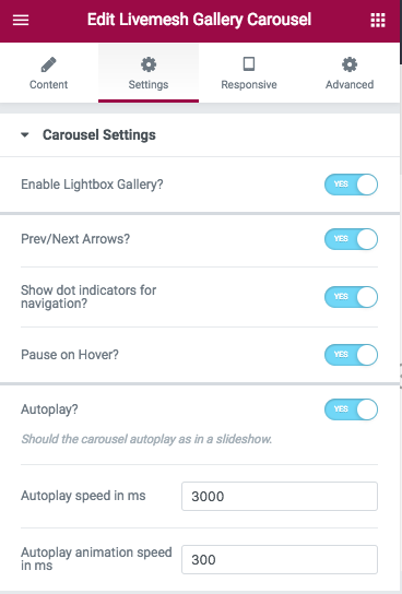
The section ‘Carousel Settings’ has options that control how the carousel is displayed. Options include autoplay speed, gutter value between post items in various resolutions, navigation controls for carousel, number of columns or items to display before making the user to scroll for additional items etc.
- Enable Lightbox Gallery – Enable lightbox gallery for images. The lightbox for the image opens up a bigger image in a popup window. You can navigate among the gallery items here.
- Prev/Next Arrows – Display navigation for the carousel.
- Show dot indicators for navigation – Display control navigation or pagination controls for the carousel.
- Autoplay – Display carousel as a slideshow.
- Autoplay speed in ms – The time between display of each page of images when Autoplay option is enabled.
- Autoplay animation speed in ms – The time taken for animation that moves the carousel to next or previous page of items.
- Pause on mouse hover – Pause the slideshow if the user has mouse hovered over the carousel contents.
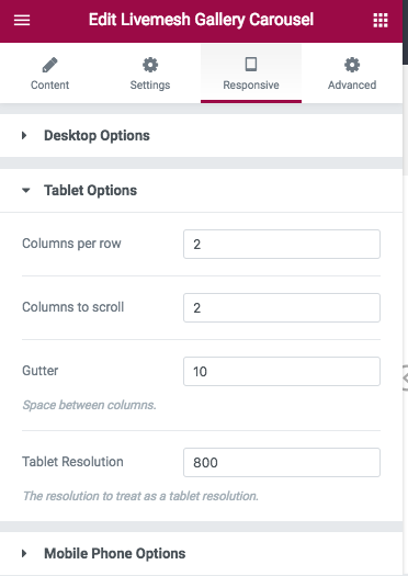
- Columns per row – Number of gallery items visible at any given point of time without scrolling. You can control the number of items visible at various resolutions like those of tablet/smartphone by providing appropriate values in the ‘Responsive’ tab.
- Columns to scroll – With each scroll action – using the prev/next arrows or the dotted navigation, specify the number of items to scroll for each invocation of the navigation controls. You can control the number of items to scroll at various resolutions like those of tablet/smartphone by providing appropriate values in the ‘Responsive’ tab.
- Gutter – The spacing in pixels between images/videos in the carousel. You can control the spacing/gutter at various resolutions like those of tablet/smartphone by providing appropriate values in the ‘Responsive’ tab.